
Thursday, May 31, 2012
Local Survey
Wednesday, May 30, 2012
PORTFOLIO IDEAS

 epicons/15695.jpg" />
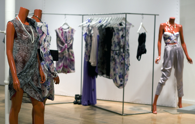
I looked through some portfolio ideas. Some portfolio looks good in simple format, it allows the viewer to draw to your drawing and you main point in each page.
I love how the image of a bottle to go across the other page, while the other page is a simple writing / story about the collection.
There is one image, where it has drape photo and hand illustration along with DDS. I think putting the draping process could give ideas where the idea is coming from.
epicons/15695.jpg" />
I looked through some portfolio ideas. Some portfolio looks good in simple format, it allows the viewer to draw to your drawing and you main point in each page.
I love how the image of a bottle to go across the other page, while the other page is a simple writing / story about the collection.
There is one image, where it has drape photo and hand illustration along with DDS. I think putting the draping process could give ideas where the idea is coming from.
Thursday, May 24, 2012
Embroidery sample
I tried to do embroider sample using domestic machine. By using zigzag, it enables me to draw line, i can also adjust the thickness of the line by making the zigzag bigger and smaller. However, the limitation of using domestic machine is you can not do satin stitches, and small details, it did not work at all. I tried to do the beading as well, however in Sydney, there are not colours and type of the beading that i want. i have to source some overseas.


HAND ILLUSTRATION FLOWERS
For the portfolio, i was thinking whether i should include a lot of drawing that i have drawn for my textile.
Moreover, i think most of the collections and designs come from orchid. Therefore, i took orchid images from internet, and tried to illustrate it. This hand illustration of the orchid could be put in the portfolio to give more personal and identity in the collection


Sunday, May 20, 2012
Screen Print and Laser cutting
AFter the drawing,i was making laser cut file of the flowers. The laser cut is supposed to have hole to where the shadow of the flowers would go in the drawing.
I used metalic fabric and silk satin to experiement with the laser cutting, whether the fabric would be cut beautifully or burnt around the edge. After the laser cutting is done, i tried to do screen print on both fabric. the metalic fabric does not absorb screen print pigment as well as dutchess. Therefore, the fabric looks like it is overpowering the screen printed flower motif. As the silk, due to its white colour and smooth texture, the flower motifs could be seen very clearly from far, which is very lovely.
However, i feel like screen print only allows one or two colours which i think it looks very dull. The idea of flowers are to have different colours and the details and serene atmosphere. I was thinking to do two screen print with different colours.


Tuesday, May 15, 2012


Sunday, May 13, 2012
LAYOUT

 I love the layout of the cover of the book. The drawing that is divided into 4 square section.
The range drawing is also really nice with different way of figure drawing. Maybe at this time i could not do different fgure drawing due to the application of the flower into the drawing. If i have more time next semester i should develop more figure drawing, and play them around to make the portfolio look much more cooler.
I love the layout of the cover of the book. The drawing that is divided into 4 square section.
The range drawing is also really nice with different way of figure drawing. Maybe at this time i could not do different fgure drawing due to the application of the flower into the drawing. If i have more time next semester i should develop more figure drawing, and play them around to make the portfolio look much more cooler.
Thursday, May 3, 2012
COLOUR WORKSHOP
The colours workshop, is the moment where we experimented with different colours through mixture of different colour of Star Dyes. We use some natural fibres so it is easier for the fabric to absorb colours more.
I use mostly silk since i am going to use silk for my collection. The dye bath normally has thicker colours, however after you iron the silk to dry the fabric faster, it goes really pale, which what i love. I am looking for more pale colours. I want to do spring/summer transition. I want some pastel fabric yet it is not a bright colour, i want the colours that express organic and traditional aspect of Batik.
I love the colours of 'Khaki", and "Mouse Grey" the best because it has the intricate and pastel colours that i love.


Tuesday, May 1, 2012
BATIK PEKALONGAN COLOUR INSPIRATION
FOr my colour inspiration, i looked through Batik to give me some ideas. I love the organic or the natural dye colours that are in Batik. Batik used a lot of indigo colours. Indigo is a very traditional and basic colour that originally the colour of Batik it is first made with. Moreover, after the introduction of synthetic dye, more beautiful pastel colours appear as it can be seen from the pictures.
There is a beauty in the pastel colours that are not presenting sweet and pure image.


Subscribe to:
Posts (Atom)